City Overview · Brand
BRAND NAME

A city built for biotechnology
Creating new value where bio meets city infrastructure
The B-CITY symbol is built from two letter “B” forms. The left and right shapes stand for industries and functions that are independent of one another; the organic structure at the center draws them into a single system for the city of the future.
-
Double BA Bio + Big Data structure
The two B forms stand for a future city system in which different industries and functions — bio and big data among them — are connected. Each form stands on its own, yet the central flow joins them into a single ecosystem.
-
DNA HelixA symbol of life and the flow of data
The negative space at the center abstracts the movement of a DNA double helix. This “Bio Flow” represents the continuous exchange between biotechnology and data-driven industries within the city.
-
Connected CoreThe hub that links the city’s infrastructure
The curved flow of the symbol stands for a city vision in which Chuncheon’s natural setting and its future industrial structure are connected. That organic movement gives visual form to B-CITY’s core philosophy: a “Connected Innovation City.”
BRAND LOGOTYPE
The B·CITY wordmark, redrawn in a bespoke typeface
A geometric sans-serif typeface customized exclusively for B·CITY
Primary logotype
- Proportion
- W : H = 6.0 : 1
- Typeface
- Custom Geometric Sans · Modified exclusively for B·CITY
- Composition
- B(Letter) + Symbol(Mint × Azure) + CITY
- Korean rendering
- 비시티 — never hyphenated as 「비-시티」
Symbol mark
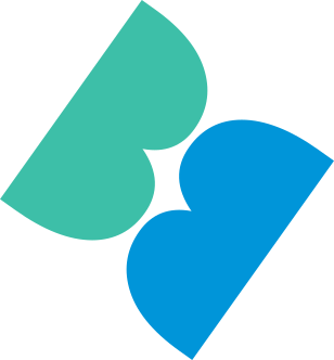
- Mint layerBio — the flow of life
- Azure layerAI — the brilliance of data
- Where the layers crossInnovation and connection
An abstract symbol of two crossing layers.
Use it with the wordmark, or on its own in small formats.
Usage and clear space
- Minimum size
- 120px / 32 mm or larger — below this, use the symbol alone
- Clear space
- At least the height of the symbol on all sides — place nothing inside it
- Color
- Three-color, mono navy, mono black and reversed white only
- Never
- Alter the proportions, rotate, add shadows, use unapproved colors, or place the logo on a low-contrast background
BRAND COLOR
Three colors in balance, one identity
Indigo is the city’s anchor, Mint the flow of life, Azure the brilliance of data. Each color carries its own meaning, and together they work as one identity
-
Indigo
- HEX
- #2C3E91
- RGB
- 44 · 62 · 145
- CMYK
- 100 · 85 · 0 · 15
- PMS
- PANTONE 2735 C
Trust · Stability · Depth · EnduranceDeep and solid, Indigo is the city’s anchor. It stands for steady delivery, dependable partnerships, and the stability of a city built to last.
-
Mint
- HEX
- #3DBFA8
- RGB
- 61 · 191 · 168
- CMYK
- 70 · 0 · 40 · 0
- PMS
- PANTONE 7472 C
Bio · Life · Growth · NatureFresh and alive, Mint is the flow of life. It holds the pulse of biotechnology — continuous as the DNA double helix — and the breath of a city where nature and technology meet.
-
Azure
- HEX
- #0095D9
- RGB
- 0 · 149 · 217
- CMYK
- 85 · 30 · 0 · 0
- PMS
- PANTONE 2925 C
AI · Data · Digital · InnovationClear and bright, Azure is the brilliance of data. It stands for the currents of light that AI and digital technology create, and for the possibilities of advanced technology across the city.
When name, symbol and color move by one set of rules,
a brand becomes the face of the city